Visual Literacy
 The emerging field of visualization studies examines the use of images to improve access to information or the communication of knowledge. Information visualization concentrates on the use of computer-supported tools (especially those that enable the user to modify the data in real-time) to derive new insights about abstract data. Knowledge visualization, on the other hand, concentrates on the transfer of knowledge between at least two persons.
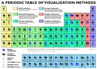
In order to make this easier to understand, the Visual Literacy website has created a wonderful Periodic Table of Visualization Methods. The table itself is a metaphoric homage to the Periodic Table of Chemical Elements, first devised in 1869 by the Russian chemist Dmitri Mendeleev. The tables are similar in that both are constructed along two dimensions: periods and groups. As you read down a column in the Periodic Table of Visualization Methods, you'll find similar methods for similar purposes but getting more and more complex. A simple roll-over reveals an example of each method, which are grouped based on their similarities.
- data visualization (pie charts, line graphs, etc.)
- information visualization (tree maps, flow charts, etc.)
- concept visualization (decision trees, Gantt charts, etc.)
- metaphor visualization (icebergs, funnels, etc.)
- strategy visualization (organization charts, stakeholder maps, etc.)
- compound visualization (knowledge maps, learning maps, etc.)
